Colour is one of the most powerful tools in a designer’s arsenal. It has the ability to transform spaces, influence moods, and even affect our physical well-being. When it comes to home decor, understanding the psychology of colour can help you create environments that not only look beautiful but also feel harmonious and support your emotional needs. In this article, we’ll explore the psychological effects of different colours and how to use them effectively in your home.
The Basics of Color Psychology
Before we dive into specific colors, it’s important to understand that the effects of color can be subjective and influenced by personal experiences, cultural backgrounds, and individual preferences. However, there are some general psychological associations that hold true for many people:
- Warm colors (reds, oranges, yellows) tend to be energizing and inviting.
- Cool colors (blues, greens, purples) are often calming and relaxing.
- Neutral colors (whites, grays, beiges) can create a sense of balance and sophistication.
With this foundation, let’s explore how different colors can be used in home decor to create specific atmospheres and emotional responses.
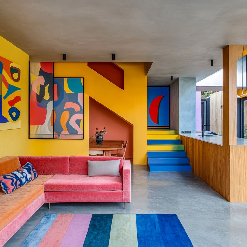
Red: Energy and Passion
Red is a bold, attention-grabbing color associated with energy, passion, and excitement. In home decor, it can create a strong first impression and stimulate conversation.
- Best used in: Dining rooms, living rooms, or as an accent color
- Psychological effects: Increases energy, stimulates appetite, creates warmth
- Design tips:
- Use red sparingly to avoid overwhelming a space
- Pair with neutral colors for balance
- Consider deeper shades like burgundy for a more sophisticated look
Blue: Calm and Serenity
Blue is often associated with calmness, stability, and tranquility. It can create a soothing atmosphere and is known to lower blood pressure and heart rate.
- Best used in: Bedrooms, bathrooms, home offices
- Psychological effects: Promotes relaxation, improves focus, aids sleep
- Design tips:
- Light blues can make a room feel more spacious
- Darker blues add depth and coziness
- Combine with white for a fresh, clean look
Yellow: Cheerfulness and Optimism
Yellow is the color of sunshine, associated with happiness, optimism, and mental stimulation. It can brighten up a space and create a welcoming atmosphere.
- Best used in: Kitchens, dining areas, home offices
- Psychological effects: Boosts mood, increases energy, stimulates mental activity
- Design tips:
- Use bright yellows in small doses to avoid visual fatigue
- Softer, buttery yellows work well for larger areas
- Pair with gray or white for a modern look
Green: Nature and Balance
Green, the color of nature, is associated with growth, harmony, and balance. It can create a refreshing and calming environment.
- Best used in: Living rooms, bedrooms, home offices
- Psychological effects: Reduces stress, promotes relaxation, enhances concentration
- Design tips:
- Use various shades of green to create depth and interest
- Incorporate plants for a natural touch
- Combine with wood tones for a biophilic design approach
Purple: Luxury and Creativity
Purple is often associated with royalty, luxury, and creativity. It can add a touch of elegance and sophistication to a space.
- Best used in: Bedrooms, living rooms, creative spaces
- Psychological effects: Stimulates imagination, creates a sense of luxury
- Design tips:
- Use deep purples for a rich, opulent feel
- Lighter lavenders can create a soft, romantic atmosphere
- Combine with metallic accents for added luxury
Orange: Energy and Enthusiasm
Orange combines the energy of red with the cheerfulness of yellow. It’s associated with enthusiasm, adventure, and confidence.
- Best used in: Exercise rooms, play areas, creative spaces
- Psychological effects: Boosts energy, stimulates socializing, increases appetite
- Design tips:
- Use bright orange as an accent color for maximum impact
- Terracotta or burnt orange can create a warm, earthy feel
- Pair with blues for a vibrant, complementary color scheme
White: Cleanliness and Simplicity
White is associated with cleanliness, simplicity, and purity. It can make a space feel open, clean, and calm.
- Best used in: Any room, especially small spaces or rooms with limited natural light
- Psychological effects: Creates sense of space, promotes clarity of thought
- Design tips:
- Use different shades of white to add depth and avoid a sterile feel
- Incorporate textures to add interest to an all-white space
- Use white as a backdrop for colorful art or accessories
Black: Sophistication and Drama
Black is associated with power, sophistication, and drama. It can add depth and create striking contrasts in home decor.
- Best used in: As an accent color, or in well-lit spaces
- Psychological effects: Creates sense of mystery, adds sophistication
- Design tips:
- Use black sparingly to avoid making a space feel small or dark
- Pair with white or metallic colors for a classic, elegant look
- Consider charcoal or dark gray for a softer alternative
Creating Color Palettes for Your Home
When choosing a color palette for your home, consider the following:
- Understand the mood you want to create: Do you want a calm, energizing, or cozy atmosphere?
- Consider the function of the room: A stimulating color might work well in a home office but could be disruptive in a bedroom.
- Take into account natural light: Colors can appear different depending on the amount and quality of light in a room.
- Use the 60-30-10 rule: In a balanced color scheme, 60% should be a dominant color, 30% a secondary color, and 10% an accent color.
- Create flow between rooms: Use a cohesive color scheme throughout your home for a harmonious feel.
- Test before committing: Use paint samples or fabric swatches to see how colors look in your space before making a final decision.
Conclusion: The Power of Personal Connection
While understanding color psychology can guide your choices, remember that the most important factor is your personal connection to the colors. Your home should reflect your personality and make you feel comfortable and happy.
Don’t be afraid to experiment with different color combinations or to break traditional rules if it feels right to you. The goal is to create a space tha
Leave a Reply